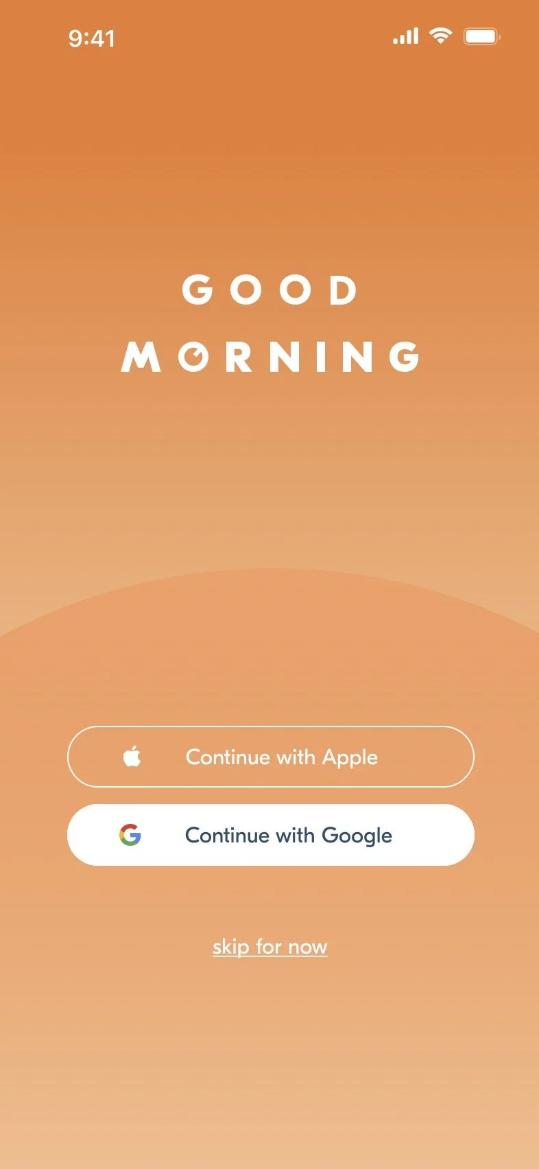
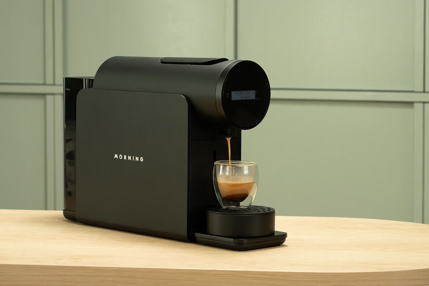
a smart coffeemaker for a smart coffeedrinker.
MORNING
UI/Ux Design & creative direction
i Designed the app UI for the coffee company, Morning. Had the pleasure of working with former VP of Design at Etsy, Randy Hunt.
Figma • Functional Wireframing • User Research • Graphic Design
☕️☕️☕️☕️
intro
what is the morning machine?
When I started at Morning, I found its flagship product, a coffeemaker called the “Morning Machine” (pictured at the top of the page) to be a somewhat intentionally overcomplicated product for coffee connoisseurs. Does everyone need the machine’s many customizable options for brew temperature? Well… no. But that’s what makes it fun! It’s a souped up Nespresso machine with a lot of customizable coffee-brewing options.
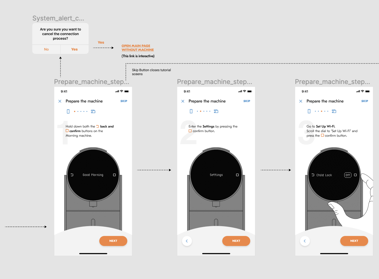
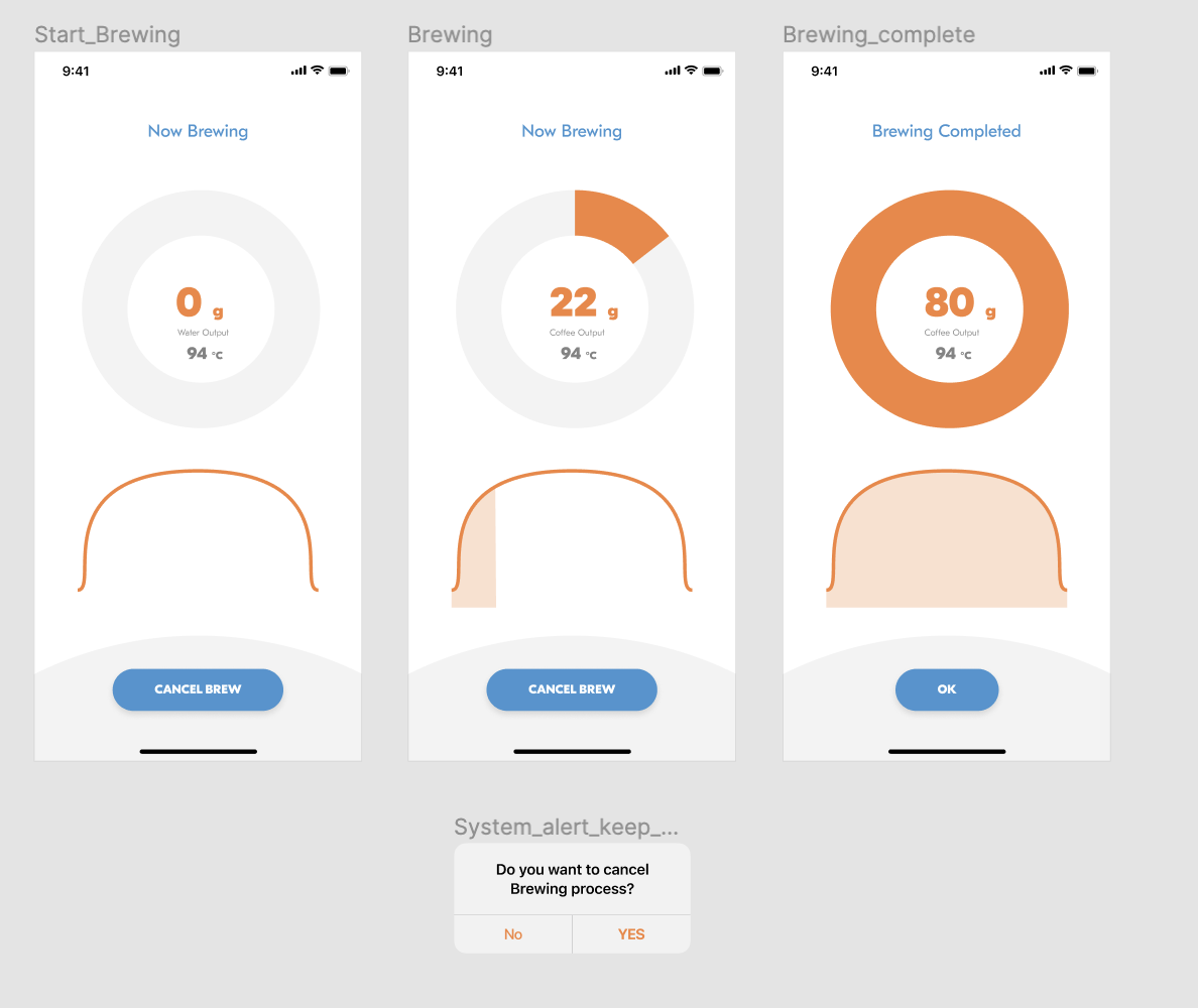
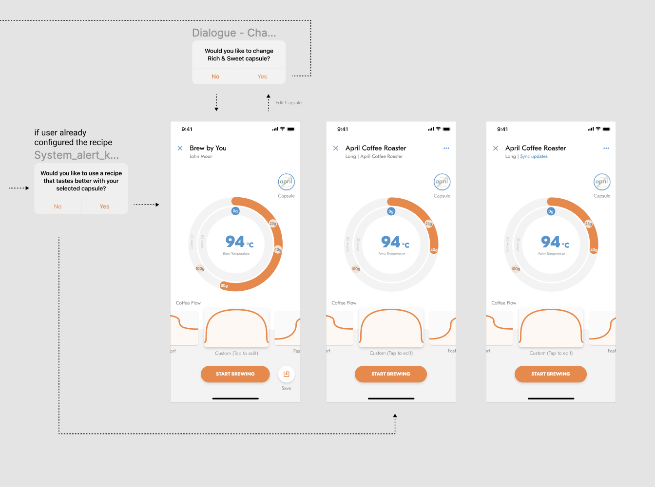
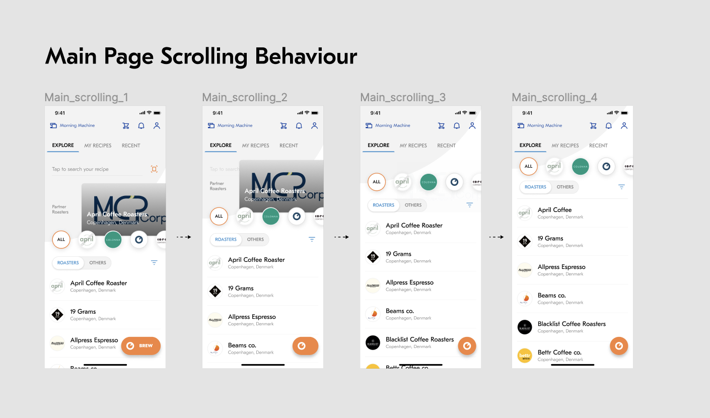
The circular screen on The Morning Machine matches up with an illustrated likeness on the Morning App (pictured below), making it possible to use your phone as a Bluetooth remote to brew your coffee pods using the machine. From the app, you could adjust brew temperature and size (oz) of the espresso pull. Below you can see images of the app as it existed before my redesign.
The problem
everything, everywhere, all at once.
From Morning’s coffee pod store to the brew process, the app had too much going on at once. It was unclear how to save favorite brands, navigate the shopping experience, and save your preferences. We needed to break everything down to basics and decide how to keep things as simple as possible, and then add on from there.
OBJECTIVES
Revamp the UI/UX for the brewing process so that it’s easily understood by both basic coffee drinkers and coffee snobs alike. Have options, but keep them visually simple!
Give the product a visual facelift. Match the tone of the app to the new packaging that Morning was about to roll out.
Make the shopping experience easier. Nest the experience to make exploration more fun and turn over more sales.
The First steps
BREAK IT DOWN AND BUILD IT AGAIN
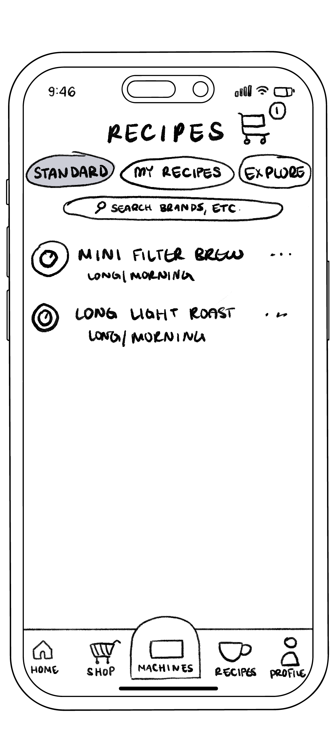
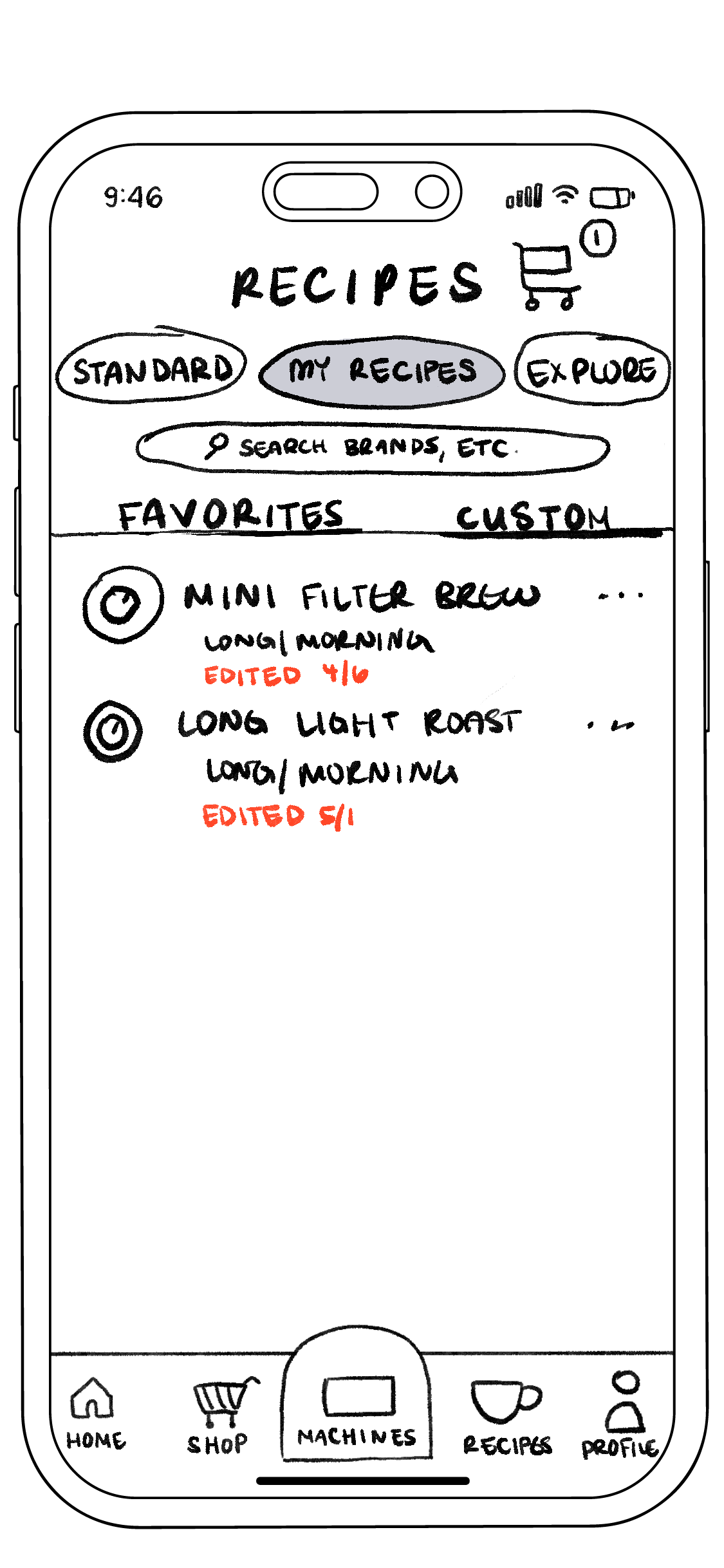
To determine which features were absolutely necessary, I needed to get off the screen and onto the page (see drawings below). Our goal: to retain the user’s optionality while keeping the app simple enough for the basic user to navigate. We needed space for: a shop, recipes, and a connection to the machine itself so that the user’s phone could be used as a Bluetooth remote for brewing with the machine itself.
How we reached these initial sketches:
Interviewing users of the beta app to gauge a sense of shopping experience and obstacles.
Working back and forth with Randy to understand his preferences for what should and shouldn’t be included.





simplifying the brew process
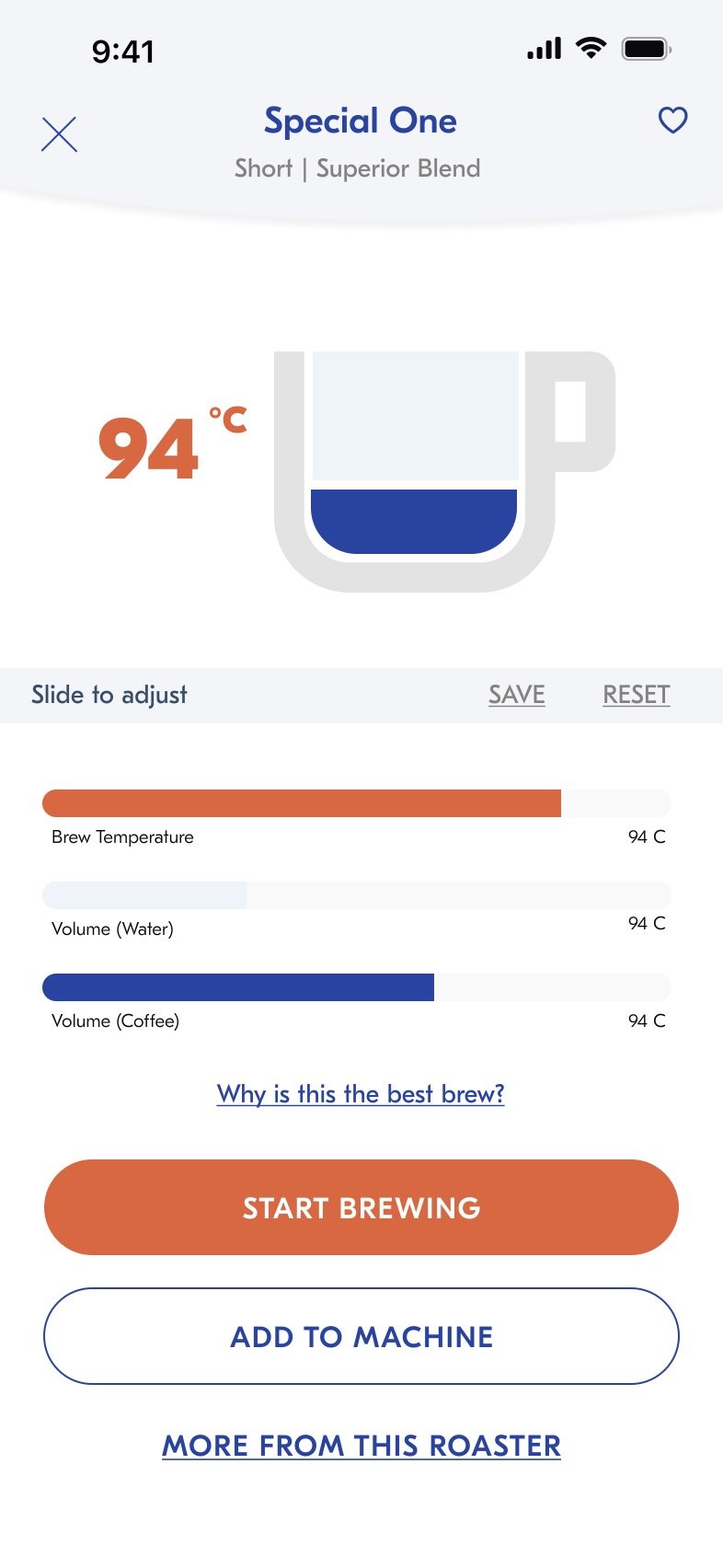
A big disconnect in the initial interface for the brew process: the visual language. There was no intuitive explanation for the radial pattern of the original designs (as shown in the “What is the Morning Machine?” section above), nor the graph below the radial pattern, which was supposed to illustrate how the water temperature was pulling the right amount and bitterness of espresso.
To remedy this problem, I iterated iconographic representations of what the final coffee pull actually looked like on screen — i.e. a simple illustration of an espresso/coffee mug with the levels of water-to-espresso clearly represented. The final result is shown below.
simplifying the Shopping experience
We wanted to divide the shopping experience into categories (brand, type of roast, region, etc.) and make it easier to keep track of the users’ likes. To get there, we used a lot of references from other e-commerce experiences. Pulling inspiration from Nespresso, Fy!, Headspace, Instacart, Apple Music, and the iBooks store, to name a few. Below is the first pass.
being picky
Adjusting the colors for the packaging
Before continuing to the functionality of the rest of the app, we needed to have a brand color conversation.
My colleague in this process Randy Hunt is a designer’s designer! It’s no surprise that he was the former head of design at Etsy. What I mean is, he values form as much as function; in tandem with making the app work we equally prioritized how it looked. The colors in the final app were deepened from the original pastels to match Morning’s signature dark blue. The palette’s weren’t identical, just similarly bold.
Finally!
The shippable product.
Below are some choice screens from the final app that we shipped. We were able to simplify and embolden the experience, making a far more intuitive shopping and brew experience.


