building a job marketplace for web 3

RADIUS
The BRIEF
“radius” is a web3 job marketplace built to make it easier for independent workers and teams to choose which contract jobs they want to work on, when they work, and who they work with.
Collaborators: Poojah shah (CEO) 👩🏽💻
Team SIze: START-UP 👨👩👧👧
FINAL RESULT: PRODUCT TO MARKET👍🏼
intro: wtf is web3?
it’s hard to keep up with the latest digital jargon. When “web3” came out, all of my friends who didn’t work in the tech were baffled — what was “web2” In the first place? and where did it go?!
Flurries of articles hurried to explain the Web3 phenomenon. As The Harvard Review puts it: “Simply, Web3 is an extension of cryptocurrency, using blockchain in new ways to new ends.” In other words, it’s a more open, democratized way to access information online.
With Radius, our main goal was to create a marketplace in web3 that was easy to understand for both employers and employees alike.
We live in a gig economy, so contract gigs are often the name of the game. Radius wanted to take contract jobs to the next level by making a smart job aggregator. How? By using blockchain to collect information about workers and employers alike to more aptly match them to jobs they’re suited for. Bonus points: These jobs could be paid with more flexibility than any found on a web2 job marketplace, as Radius runs on decentralized (crypto) currency.
In other words, we aimed to create an algorithmic system tailored to matching you, the contract worker, to work that you’re best suited for. Less searching, more finding.
We wanted to answer the following questions:
How can we make it easy for workers to find new contract jobs?
How can we make it easy for employers to connect with new workers?
How can we make it easy for workers to understand a decentralized job marketplace if they’ve never even heard of one before?
OBJECTIVES
Identify our initial target user base and cater to their needs first.
Build on individual worker profiles to include teams of workers as well.
Simplify! Narrow down the info that an employer and employee need to provide to make this process as simple as possible.
organizing our thoughts
The beginning of my process: making a bunch of lists! I want to make sure all priorities are met, so it’s helpful to see them all written out into tidy little sections.
reviewing former prototypes
To best understand what I needed to improve across the Radius interface, I did a deep-dive review of old prototypes from a former wireframer. Pooja’s note: The former screens were too wordy/complex and very flat; there wasn’t anything very exciting about them. It was my job both to make it more functional and bring some branding life to it, for which I had to work back and forth with the software team and, eventually, a contracted branding agency.
part one: grants
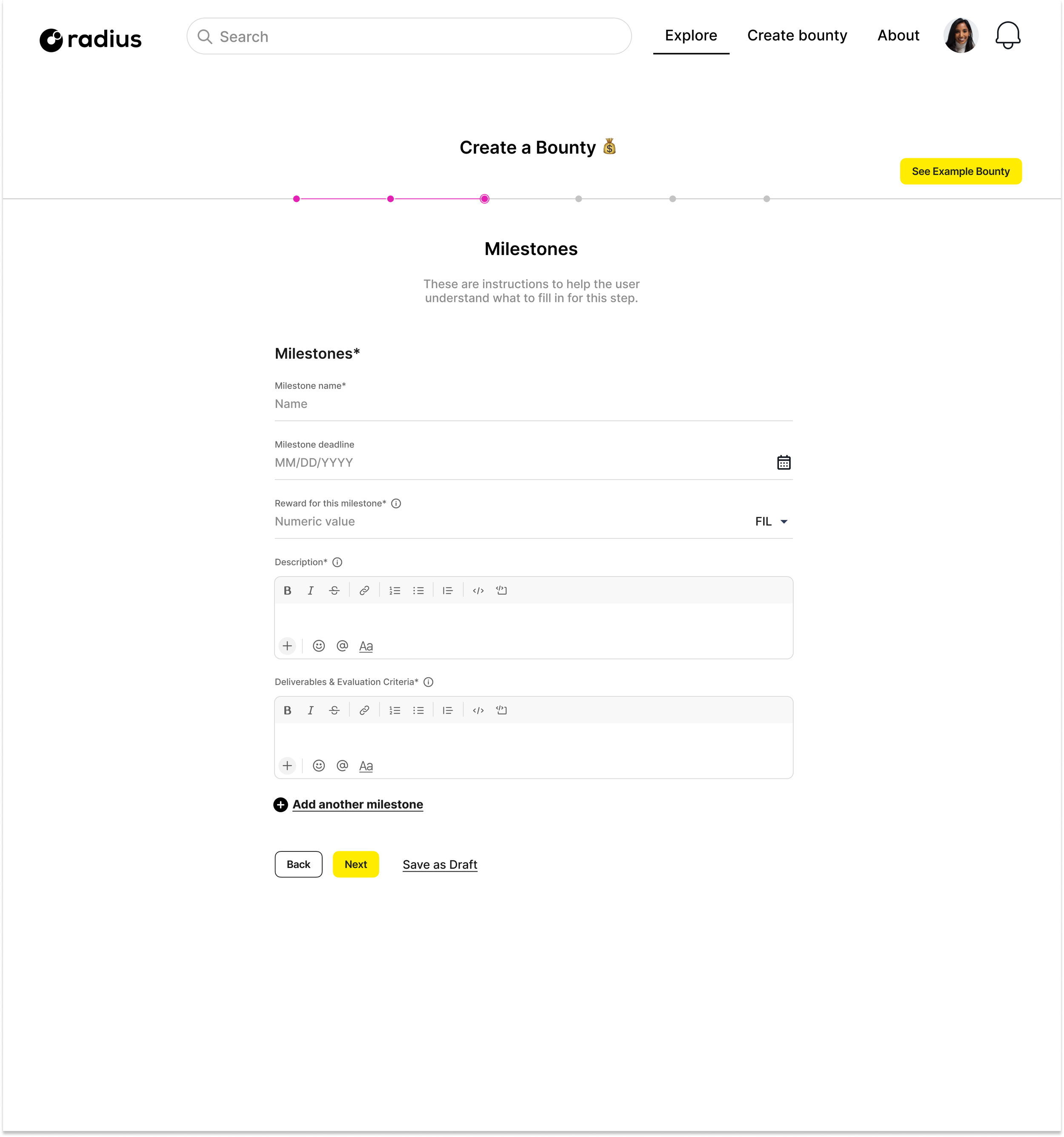
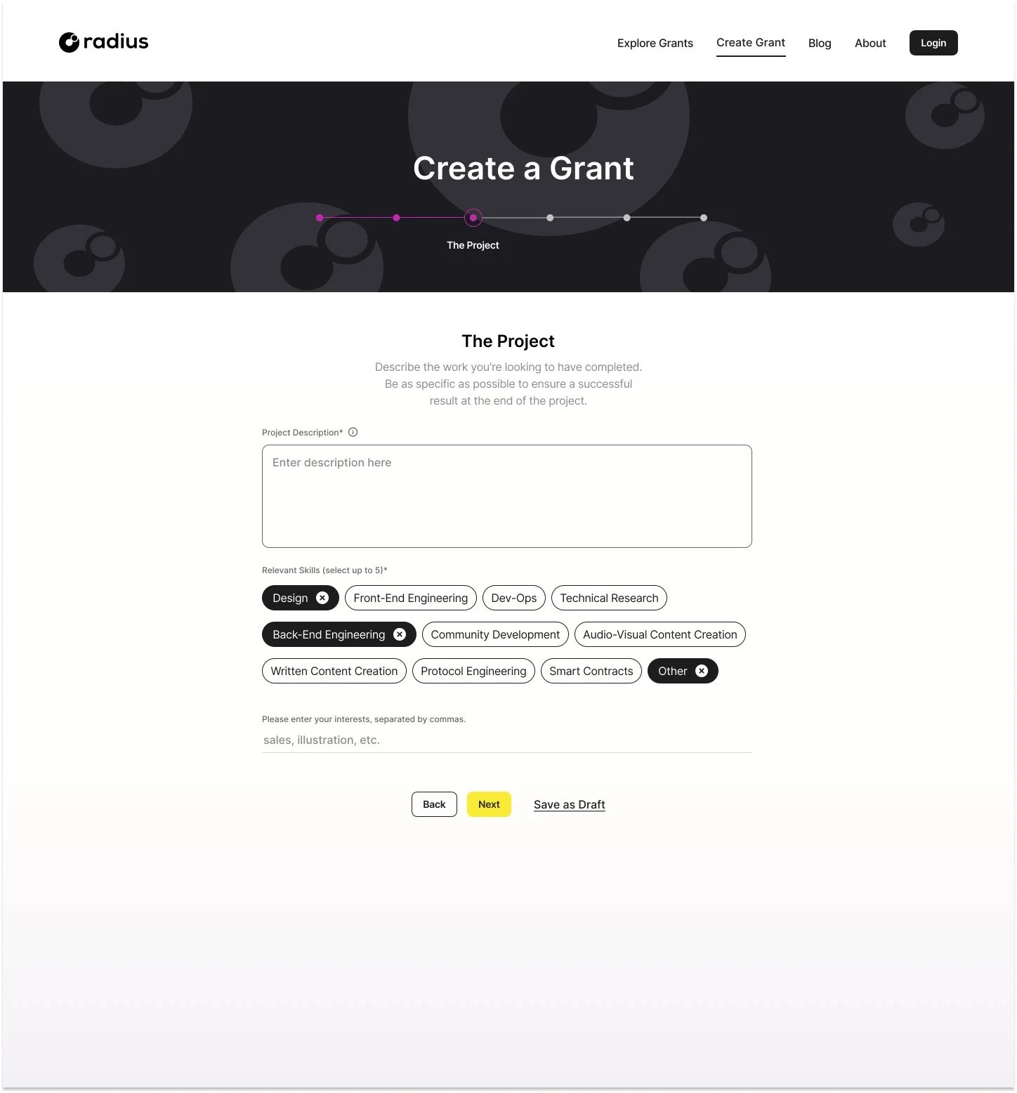
A “Grant” is what’s most fundamental to Radius’s service — it’s a job description with a list of specifications (duration, pay, etc.) that a worker can apply for through Radius. This was the first draft of the Create a Grant flow - I wanted to make it simpler and brighter than the former wireframes. This version I found too pastel and still a bit too complicated… a good first run, though.
This took the most back-and-forth between Pooja and I, as we really wanted to get our fundamental product right!
part one, take two: grants
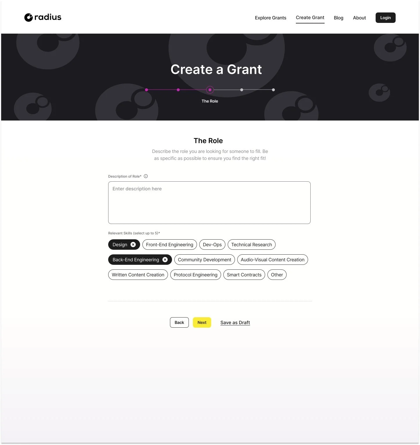
After a number of drafts (on so many white boards… I wish I took pictures!!), we were able to simplify this onboarding experience to 6 screens, without congesting each screen with too much info.
The process leading up to this point:
Zoom-interviewing a control group of users to see where they got stuck.
Google-Surveying a greater group of users to see if our changes helped
Constant back-and-forth with the software team to see what was feasible.
part Two: profile
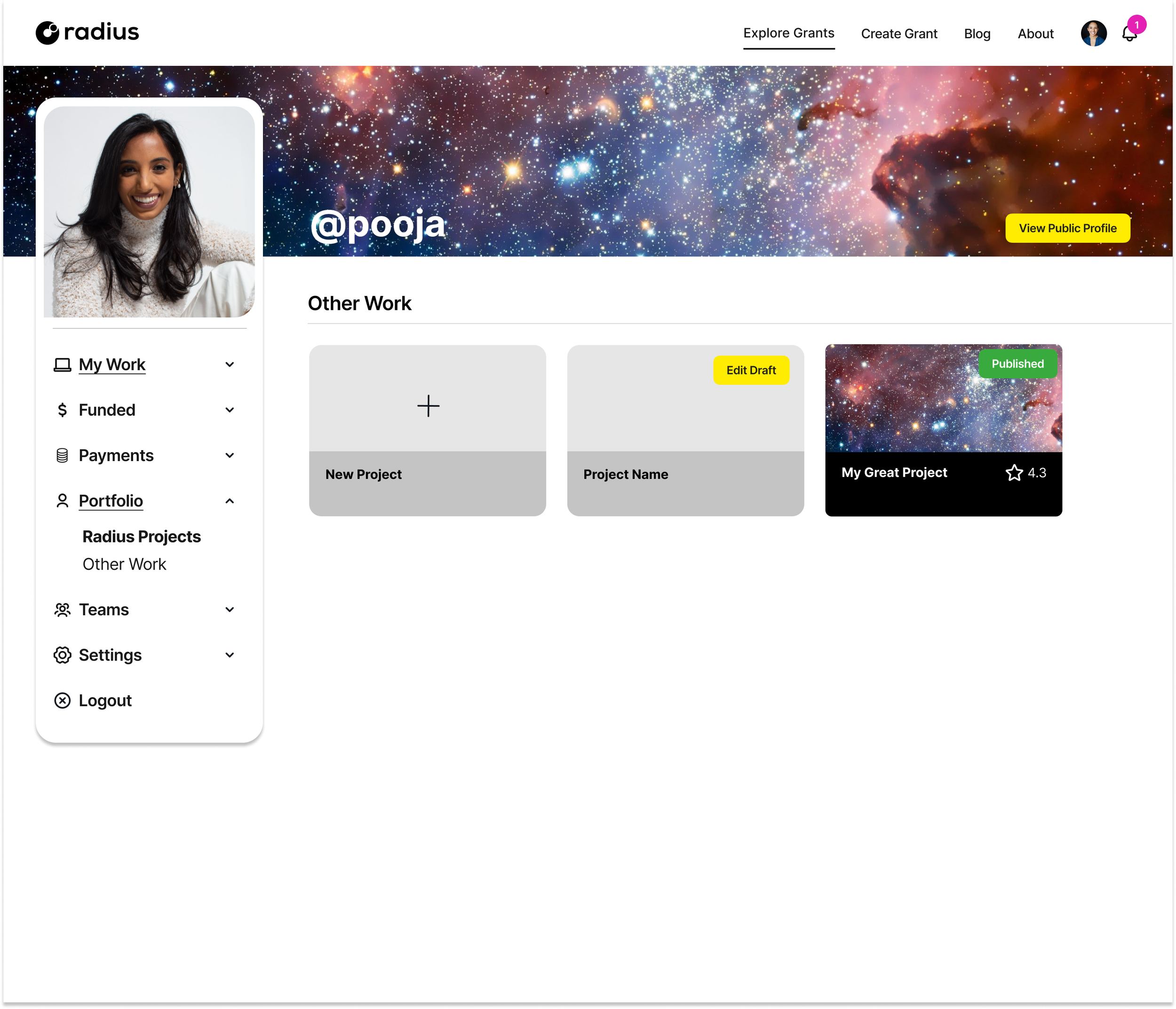
Similar to the Grant process, we wanted to simplify both the Profile and the Profile Onboarding flow. We decided to make the onboarding into a modal, so it could be more easily set-up on both desktop and mobile interfaces. Below are some screenshots of early drafts.
Profile: Set up flow
The process leading up to this point:
Google-Surveying users to see where they got stuck
Constant back-and-forth with the software team to make adjustments and re-test
Profile: USER VIEw
This is what the worker sees when setting up their profile.
Profile: PUBLIC VIEw
This is what the employer sees when looking at a worker’s profile.
(I would share the mobile screens here as well but those are protected by NDA!)
part three: teamS
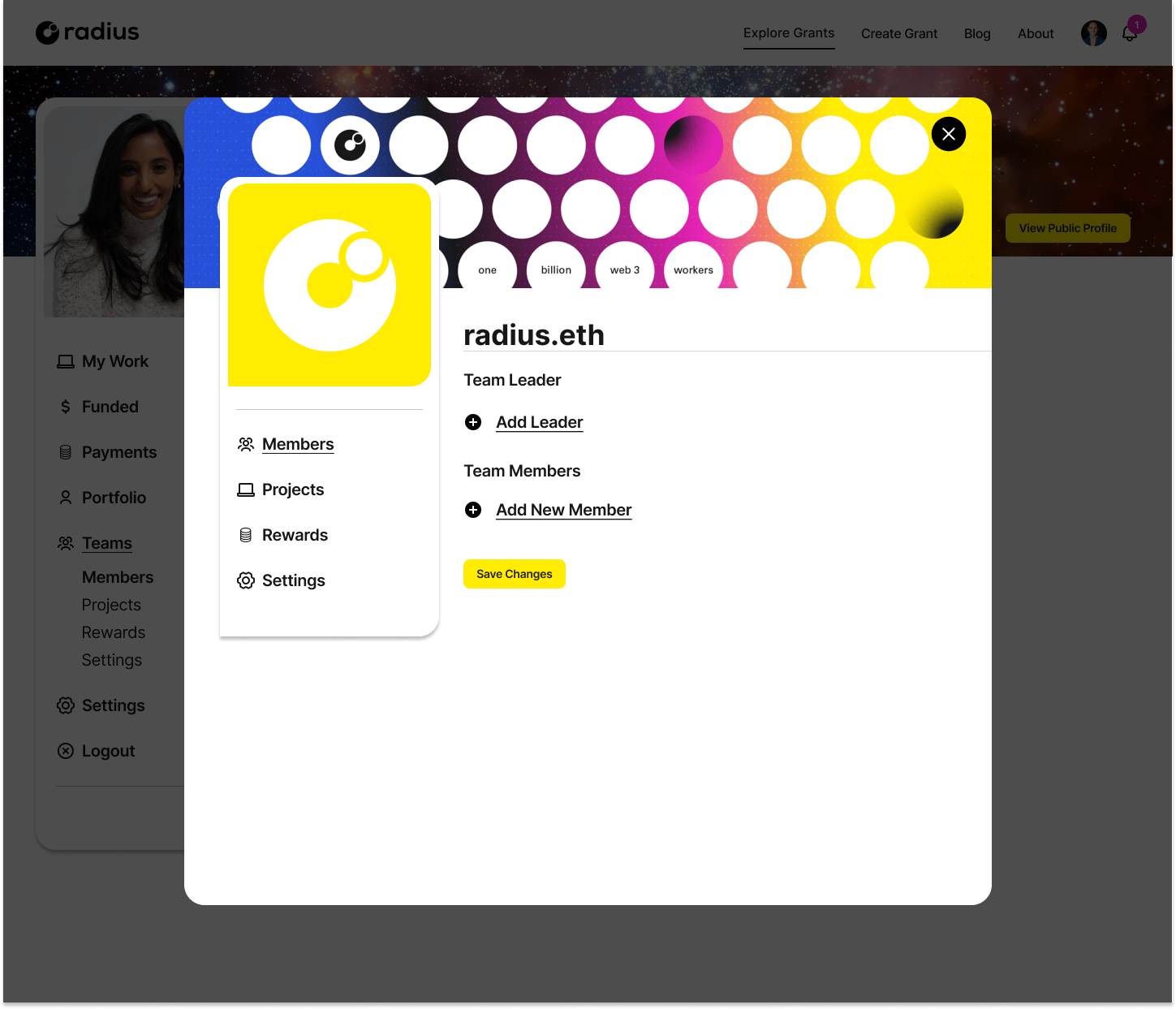
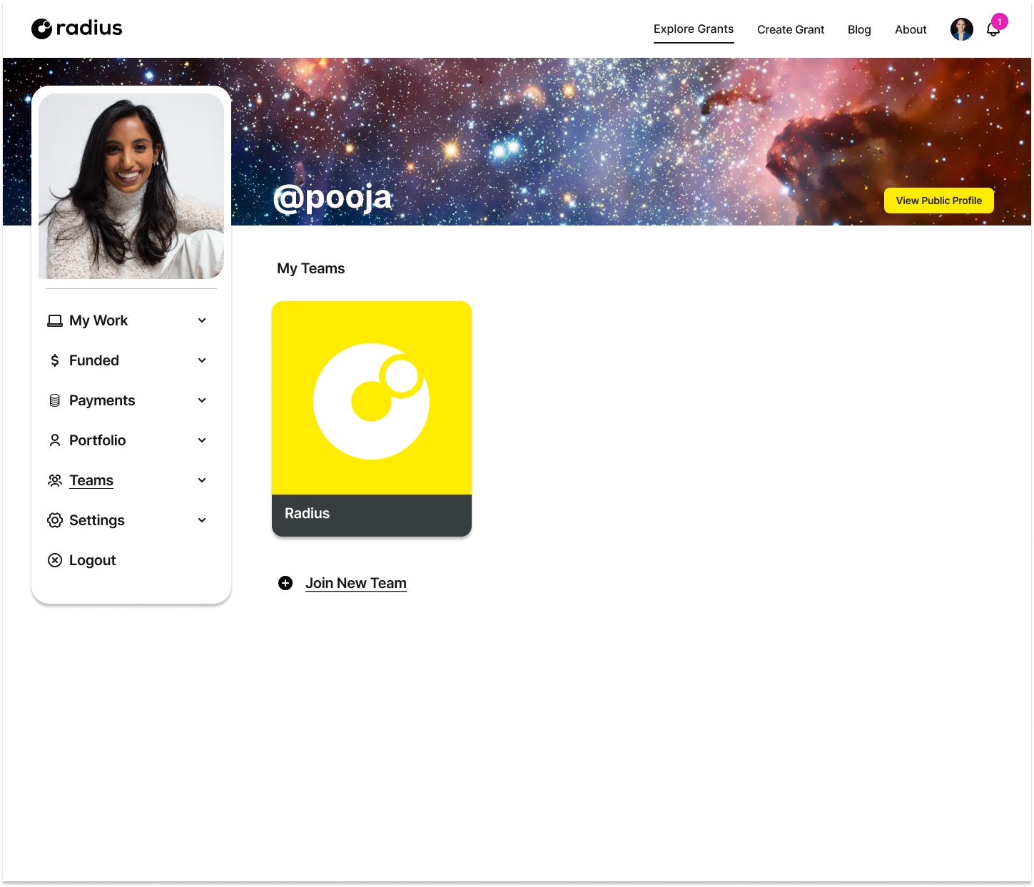
Now that we had a functional user profile, we wanted to make it possible for groups of workers to apply as “Teams,” and save those groups to their profiles.
We needed to make a Teams page that could be translated to mobile easily, so we used a modal for the desktop version, like we did with the user profile. We’d initially tried a click through teams page, but after doing some user research with a couple of test groups, we found that made it too hard to click all the way through. Having the ability to exit a modal was much easier.
landing page!
Finally, we needed a bright and poppy landing page to attract users to test all of this stuff we built. I worked with an agency to settle on this color scheme. We wanted something eye-catching and clear to make the idea of a “web3 marketplace” as easy to understand as possible.
cherry on top: the radius logo.
The company wanted something connotative of “Radius” as a mathematical term and the “selection” of a job, which is how we settled on this shape that accomplished both. Again, I led a design and branding team to come up with this special little symbol. It was fun to look through the different versions until we found this perfect fit!


